

An Art Gallery Builds Its Look from Three Lines
Underline Studio uses three simple lines and colours from paintings to connect the gallery's printed materials.
The Varley Art Gallery of Markham has a clear and colourful visual style. Underline Studio in Toronto created it using ideas from the gallery itself. The gallery holds Canadian paintings and offers classes and workshops for local people. Its shared look connects these different activities through simple shapes and strong colours. It brings the gallery's art into the material people take home.
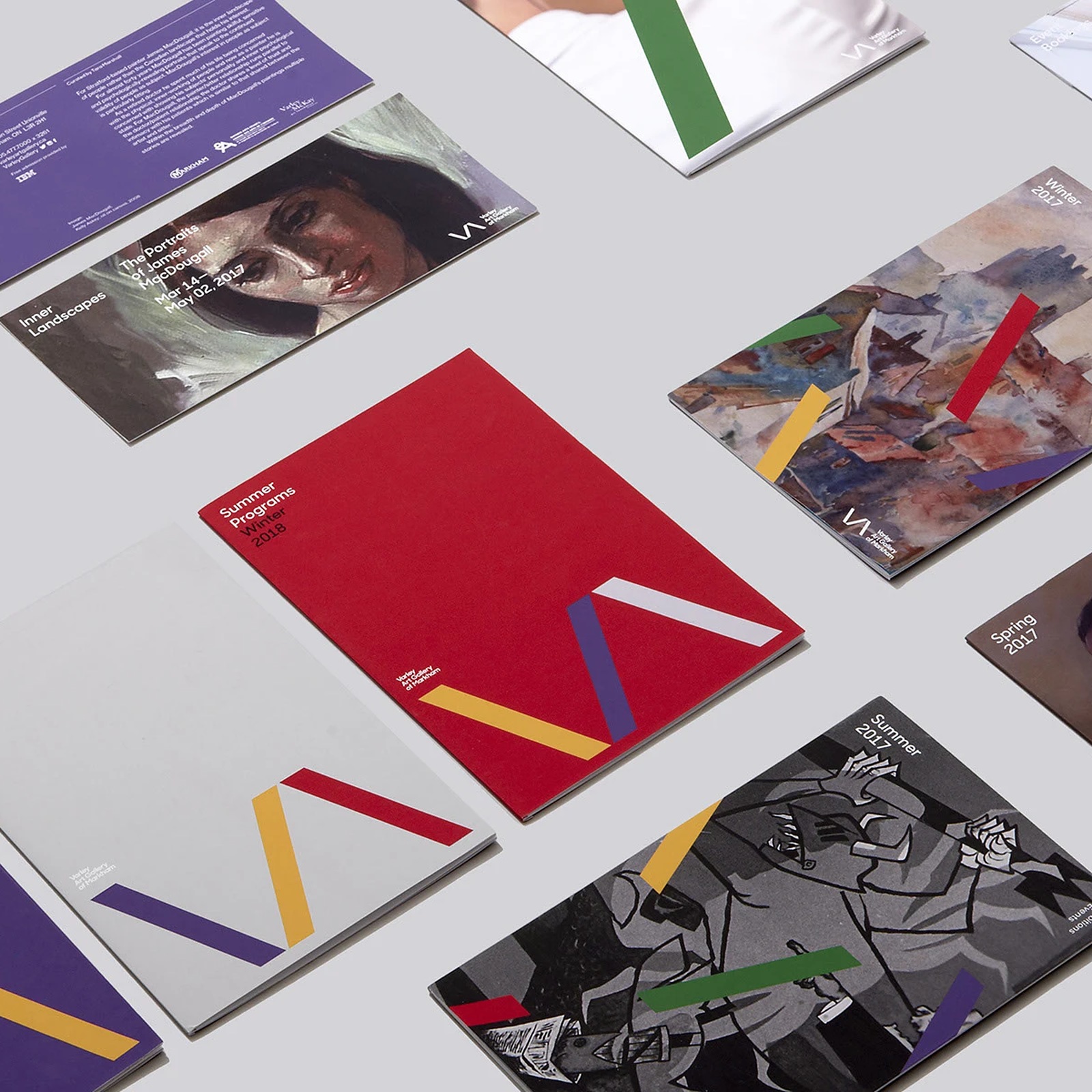
The main sign uses three lines to suggest the letters V and A. Two lines meet at the bottom to make the V shape. A third line sits next to them to suggest an open A. The studio chose colours found in paintings from the gallery's collection. These include deep blues, strong reds, warm yellows, and dark greens. The colours give the simple lines a clear link to painting.
The three lines can also work separately across the gallery's printed material. They cross pictures and help form the design of different covers. On one children's programme cover, a wide purple line crosses a student's photo. Other guides place coloured lines over paintings and drawings from exhibitions. So the main sign becomes more than a small mark in a corner.
Some seasonal guides keep all three lines together near the bottom. The sign is large, but the title stays small at the top. This leaves a clear place for the words people need to read. Different colours help the same shapes work across several printed guides. The result is a shared look for exhibitions, classes, and community events. A small set of parts can support many different gallery activities.
Key expressions
take home
집으로 가져가다
Visitors can take home a printed guide.
next to
~옆에
The third line sits next to the other two.
work together
함께 기능하다
The colours and shapes work together across the guides.
Generated with AI. AI can make mistakes.