

How Properly Connected Axi's Brand, Website, and Trading App
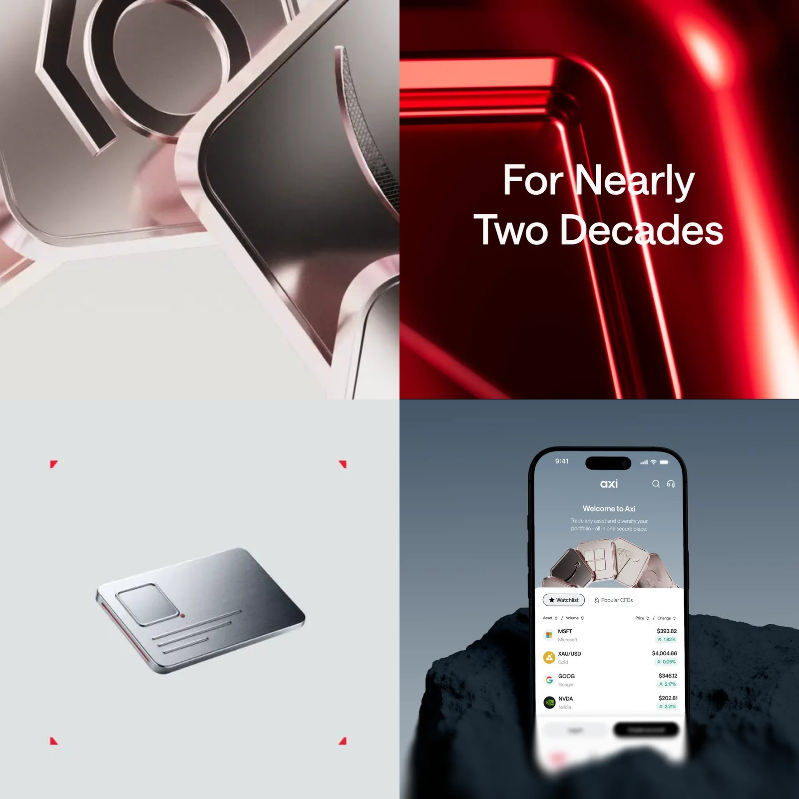
Properly connects Axi's brand, website, and trading app through shared colors, typography, layouts, and images.
Properly updated the identity of Axi, a global online trading provider. The project included its brand, a 150-page website, and trading app. The team completed this work in four months, covering more than a logo. It designed the different parts together so they would feel connected. The same brand rules appear in advertising and inside the product.
Properly kept Axi's existing logo and its well-known red color. It placed that red beside pale backgrounds, gray color changes, and dark rock photographs. Red appears in small details rather than covering whole backgrounds. It can mark a chart point, a corner, or one word. This careful use supports the brand across more than a hundred markets.
The team also replaced the old typeface, Caros Soft, with Axi Saans. A typeface is a set of letters with a shared design. This custom typeface has more square curves and a more mechanical appearance. It appears in headlines, app labels, and the first steps for new users. The letters help these different messages feel part of one brand.
Product pages use a grid to organize information into clear cards. Each section presents a fact, such as the available products or trading platform. The team also created 3D images for different trading categories. These include metal tiles, lock symbols, checkmarks, and gold or copper bars. Generative tools helped produce these images instead of traditional 3D work for every asset.
Campaign images follow the same system as the website and app. The team used a custom AI process to create figures for regional campaigns. People then refined those images by hand before using them across formats. Banners and animations share details with app cards and smaller interface elements. Repeated red marks, rounded corners, and card layouts hold the whole identity together.
Key expressions
feel connected
서로 연결된 느낌을 주다
Shared colors help the different pages feel connected.
rather than
~보다는
We changed the layout rather than the logo.
by hand
직접 손으로
The designer refined the image by hand.
Generated with AI. AI can make mistakes.