

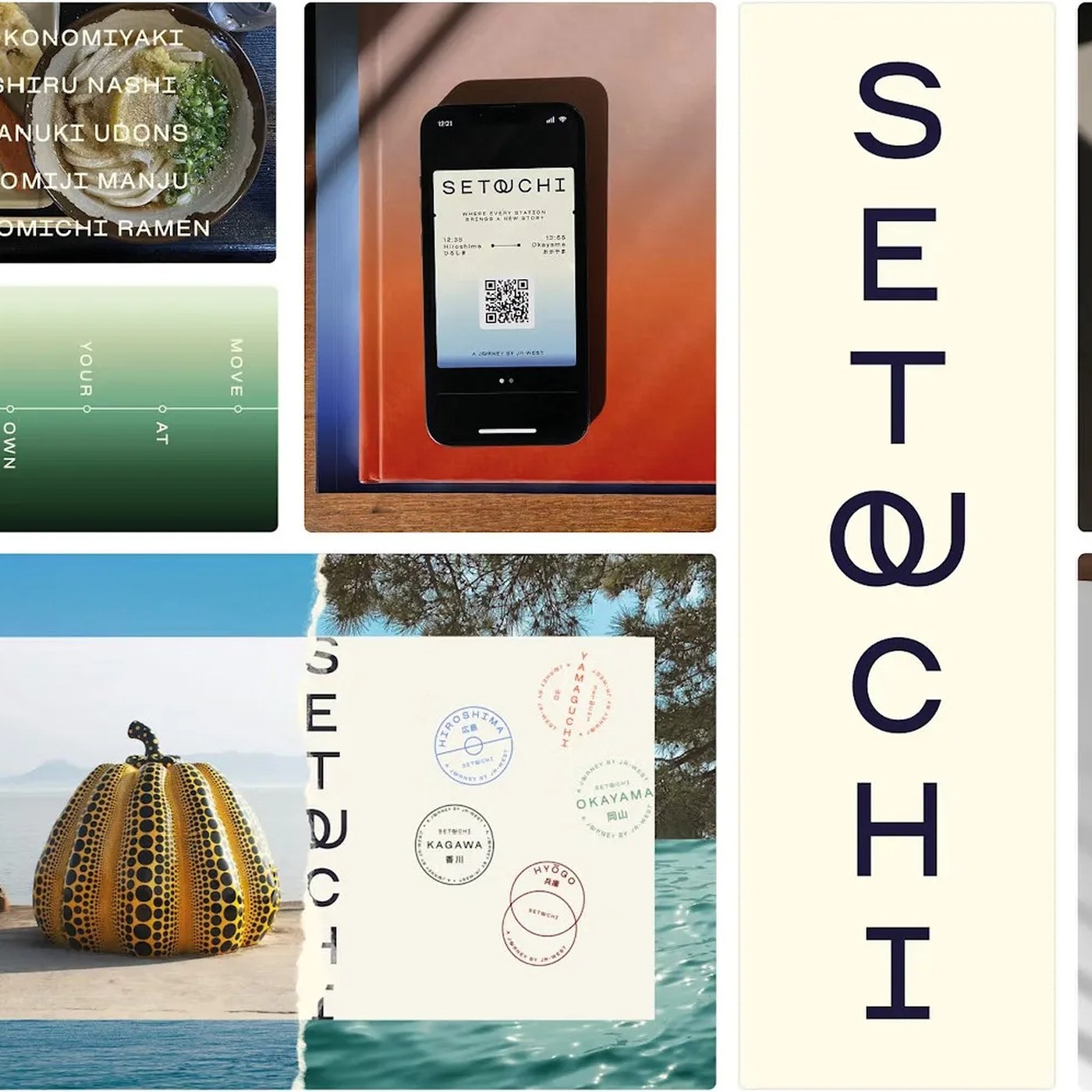
A New Look for Setouchi, Two Letters at a Time
A small change to an existing font helps Setouchi look consistent in print and online.
The Setouchi region in Japan wanted visitors to see it as a calm place. Saffron Brand Consultants built a new look around that idea. The team did not use bright, loud signs to attract attention. Instead, it asked Blaze Type to make a font for the region. A font is a set of letters with a shared look.
Blaze Type started with a font it already had, called Osmose. Its open shapes already fit the calm look. The team made small changes to the space between letters. It also joined the letters O and U in a special way. That join gives the region’s name a shape people can notice.
The joined letters also appear outside the region’s main logo. They can show up inside words in titles and other text. This gives the letters a use beyond showing the region’s name. The article shows the font in brochures and on website pages. Open spaces and soft colours help the text keep its quiet look.
Many people make materials for different organisations in the region. Using the same font gives those people a shared starting point. They do not need to make every page look exactly alike. The joined letters can appear when the words call for them. A small detail can help different materials feel like they belong together.
핵심 표현
start with
~으로 시작하다
Let’s start with the font we already have.
fit the look
분위기와 어울리다
The soft colours fit the look of the page.
belong together
서로 잘 어울리다
The pictures and words feel like they belong together.
AI를 사용해 생성되었으며, AI는 실수를 할 수 있습니다.