

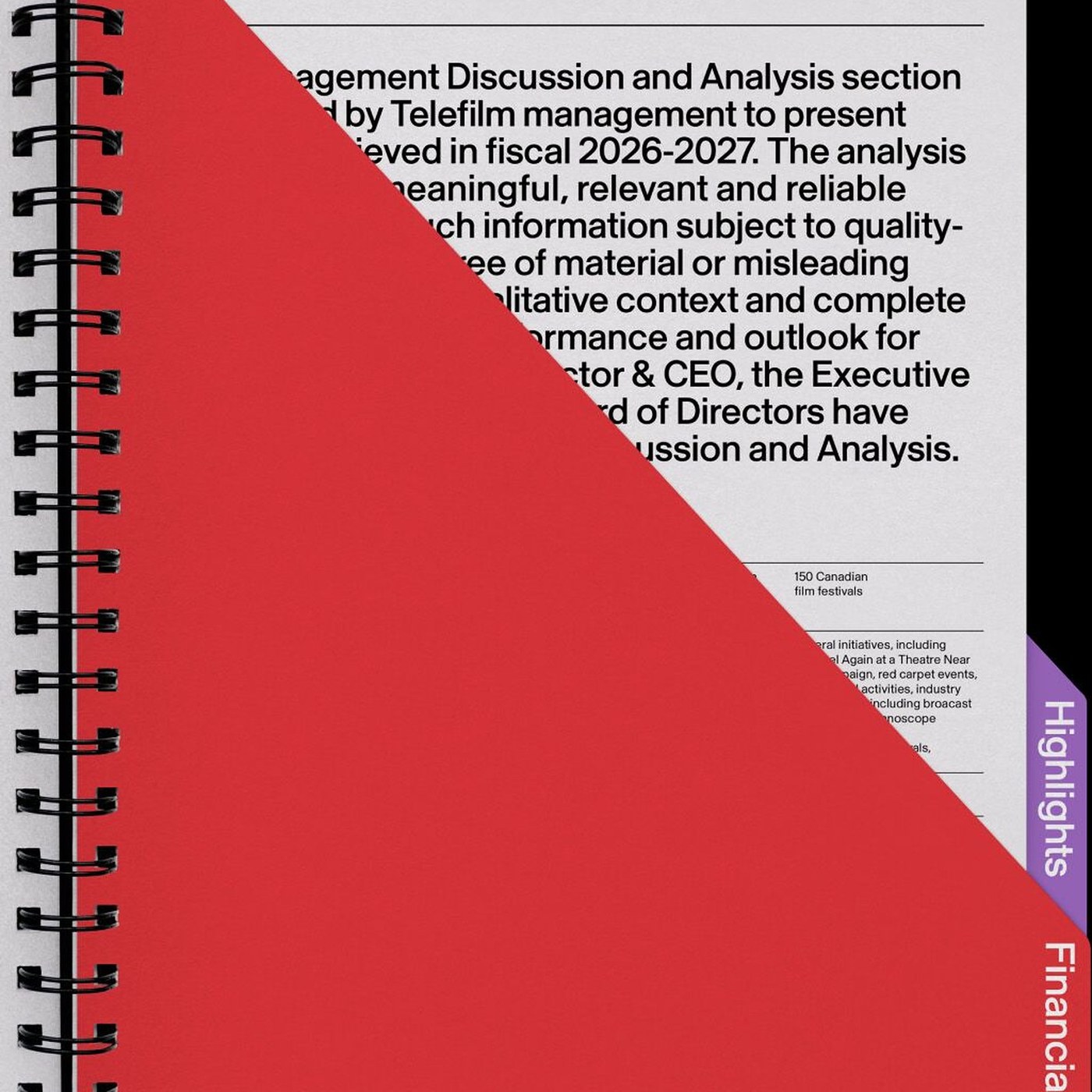
A Film Organisation Builds Its Look Around Light
Caserne gives Téléfilm Canada a connected look using shapes from cinema light.
Téléfilm Canada supports Canadian and Indigenous films from writing to public release. It wanted to rethink how people see the organisation in public. Its plan for 2024–2027 provided the starting point for this change. Montreal design studio Caserne created a connected look for different uses. The main idea came from the shape of light in a cinema. This gave the team one clear idea to use across its work.
The studio chose three angles: 30°, 45°, and 70°. These guide the sloping edges used across the whole design. Staff and outside partners can follow the same rules each time. They do not have to choose a new angle by eye. In a report, a red cover opens across a white page. The shape also lines up with a purple section along the edge.
The letters in the TELEFILM name share this interest in angles. Small cuts appear on the corners of several large letters. The name still stays clear when it appears at small sizes. Caserne also chose SN Skandia for both large titles and detailed tables. On a page about a Xavier Dolan film, the shape frames a picture. It helps direct attention to the film rather than extra decoration.
The idea also works on objects people can hold or wear. One purple invitation uses a cut edge and a simple paperclip. A blue event card clearly separates the event from the person's name. A white cloth patch carries the name on a black jacket. These examples show the design working beyond a report or a screen. The same basic shape connects formal documents, event materials, and everyday clothing.
핵심 표현
come from
~에서 나오다
The main idea comes from the shape of light.
line up with
~와 나란히 맞다
The cover lines up with the edge of the page.
pay attention
주의를 기울이다
Readers pay attention to the film image.
AI를 사용해 생성되었으며, AI는 실수를 할 수 있습니다.