

Woven Welcomes More Women into Triathlon
Woven uses its design and words to show that more women can belong in triathlon.
Ironman wanted more women to take part in its sporting events. It already had a group called Women For Tri for women. But the organisation wanted the group to reach more people. It asked Essential Viewing, a studio in New Zealand, to help. The studio made a new name and look for the group.
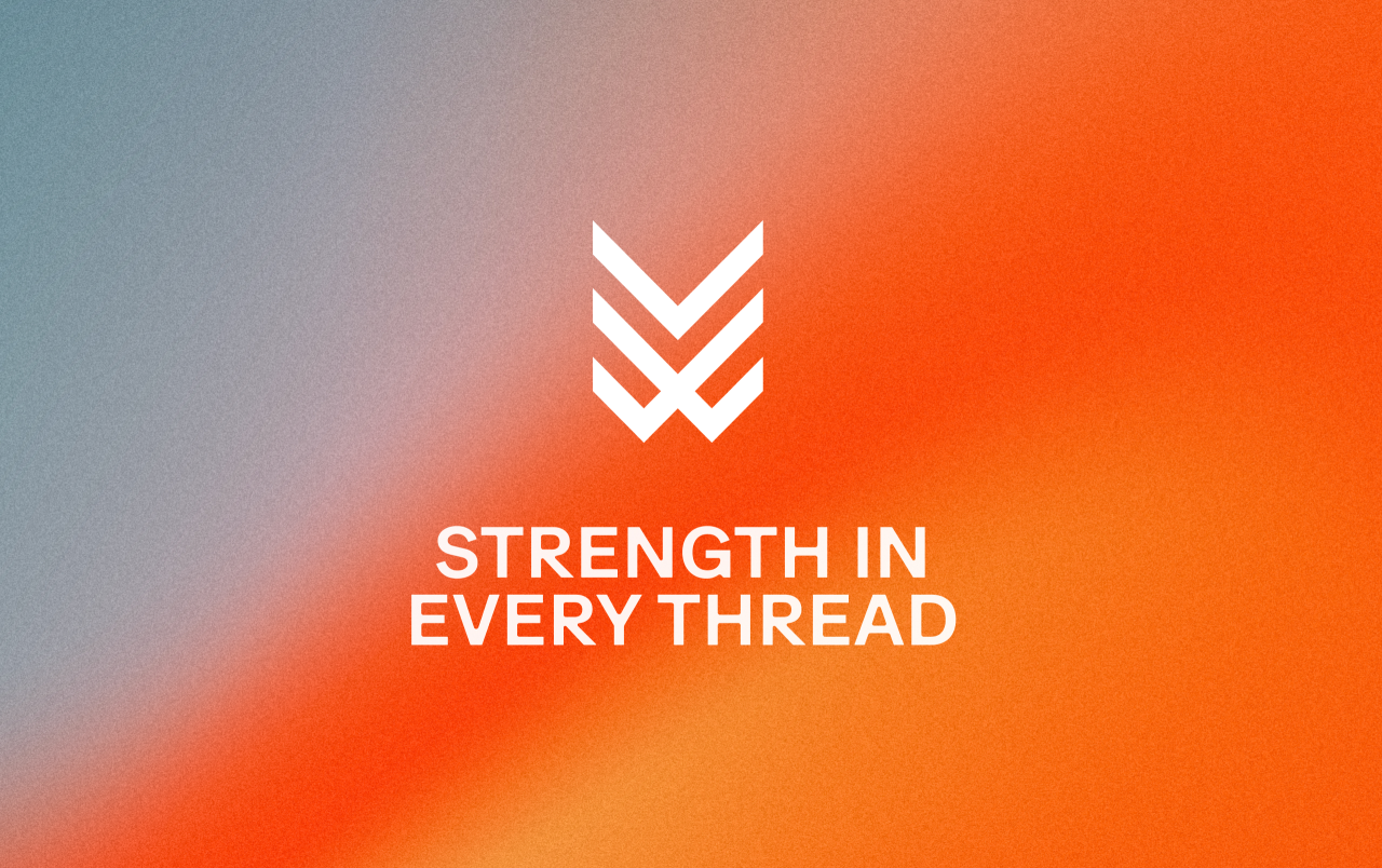
The new group is called Woven and focuses on triathlon. A triathlon is a race with swimming, cycling and running. The studio made a sign with three parts that fit together. Each part stands for one of the three parts of the race. Together the parts also look a little like the letter W. The sign can appear on clothes or on small metal pieces.
The words and pictures show many sides of the women who race. The campaign shows a swimmer working hard and a mother with her child. It also names jobs and roles people have away from sport. This helps show that people can belong without being full-time athletes. The pictures keep details like tired faces and moving water. They show the effort that goes into the sport.
The studio used strong colours and took ideas from music culture. Orange can show energy, while blue can show care and support. The brand was first shown at the world championship in Hawaii. It has since reached 45 territories, according to the article. Its message is that women with different lives can try the sport.
핵심 표현
take part in
~에 참여하다
I'd like to take part in the race.
stand for
~을 나타내다
Each colour stands for a different mood.
fit together
서로 잘 맞다
These three shapes fit together.
AI를 사용해 생성되었으며, AI는 실수를 할 수 있습니다.