

An Ice Cream Brand Made for the Night
HOW+HOW gives Snooz a nighttime look through dark colours, moons, and photos.
Ice cream often uses bright pictures of summer and the sea. HOW+HOW chose a different direction for the ice cream brand Snooz. The article says 60 percent of ice cream is eaten after 6pm. The team built its design around that evening habit instead. Snooz presents the product as helping people get ready for sleep. The design brings that idea into its colours, words, and pictures.
Dark blue areas replace the usual sunny scenes and summer patterns. Light purple moons and stars help create the feeling of night. The name Snooz appears in large, soft letters with round shapes. Two partly hidden moons sit inside the letters of the name. Together, these details connect the product with bedtime rather than daytime. The brand repeats this idea through several different parts of the design.
The words around the name are short, playful, and easy to notice. Some appear very large, while smaller messages sit near the corners. The different sizes let the main words get the most attention. Dark blue tubs carry the same look for the ice cream. The range includes salted caramel and chocolate, according to the article. A purple eye mask takes the idea beyond the food pack.
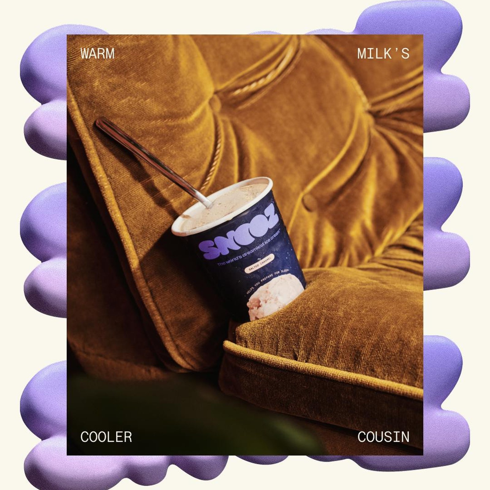
Photos also follow the rule of building the brand around night. They use strong camera light in dark places rather than sunny outdoor scenes. A set of three posters appears in a lift with purple lighting. These choices keep the same idea across objects, pictures, and spaces. The work connects the product's evening use with one clear look. Its starting point is when people eat, rather than familiar summer images.
핵심 표현
get ready for
~을 준비하다
I get ready for bed after reading.
get attention
주목을 받다
The large words get attention first.
follow the rule
규칙을 따르다
Please follow the rule when you make a new picture.
AI를 사용해 생성되었으며, AI는 실수를 할 수 있습니다.