

A Museum's New Look Starts with Its Building
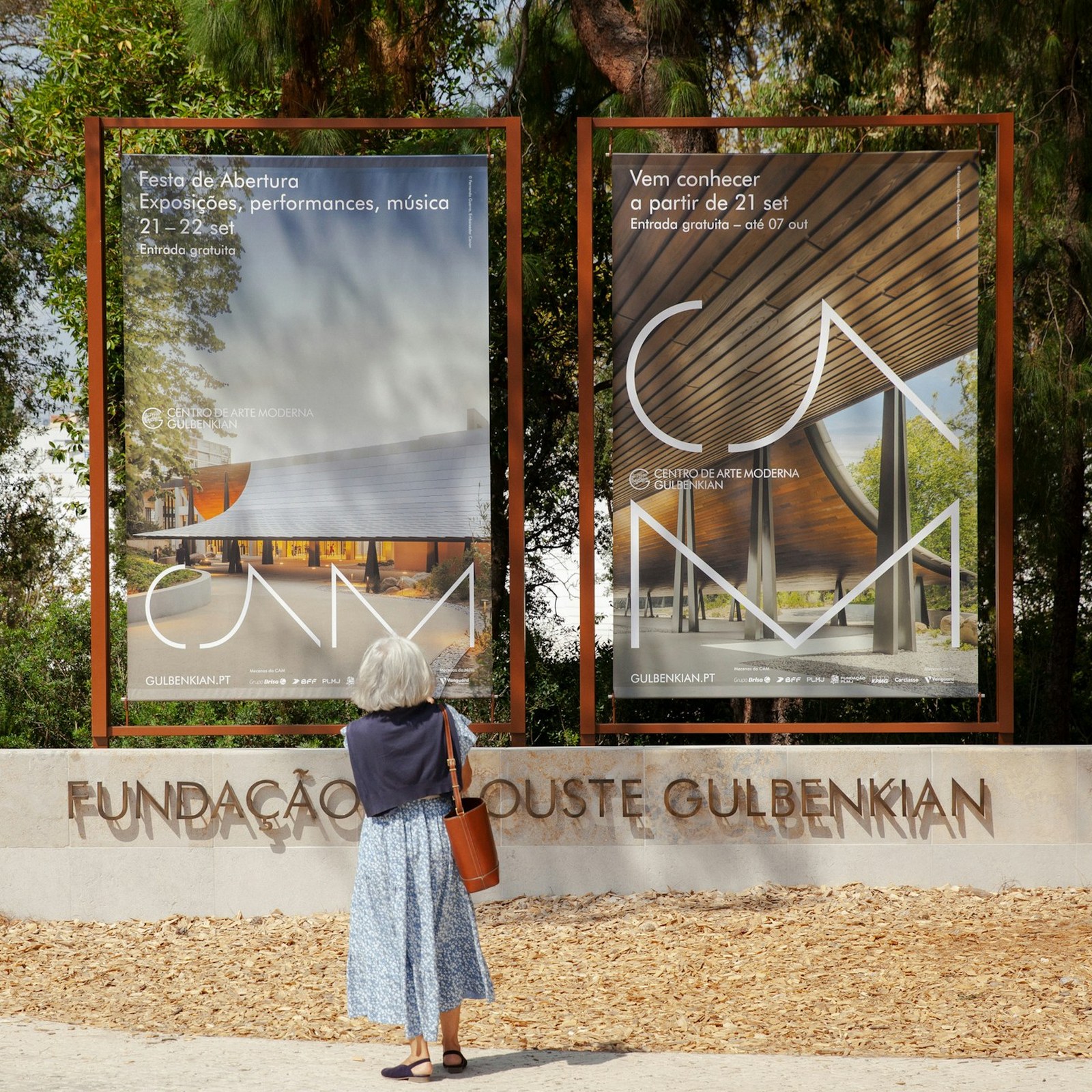
CAM's design connects large letters to the building while using repeated colors and different text sizes to bring everything together.
A Practice for Everyday Life made a new look for CAM Gulbenkian. The museum's building helped the studio choose how the letters should look. Kengo Kuma's roof has a strong curve above the museum. The designers gave the letter A a curve that follows that shape. They used thin lines for the letters C, A, and M.
The three letters can become very large on a poster or large sign. Photographs of the building sit behind them, connecting the letters to the place. Smaller words give people the details about an art show. This difference in size gives the big letters and information separate jobs. The museum's full name stays small beside its short name.
The studio repeats a deep blue across different things the museum uses. Other colors include a yellow-brown shade and a soft green. The same choices appear in printed things and on screens. A blue tram carries the large letters along a Lisbon street. Repetition helps these different pieces feel like they belong together.
The museum restaurant has a softer look within the same overall system. Its name looks like writing by hand beside the museum letters with their simple shapes. The menus use a different letter style to support that warmer feeling. The work was made when the museum opened again in September 2024. It connects the building, art information, and restaurant without making everything the same. These repeated choices give different places the same museum look.
핵심 표현
bring together
하나로 모으다
The colors bring together the different pieces.
stand beside
~옆에 놓이다
Small words stand beside the large letters.
feel like
~처럼 느껴지다
The restaurant design feels like part of the museum.
AI를 사용해 생성되었으며, AI는 실수를 할 수 있습니다.