

Pact Builds a Brand from One Square
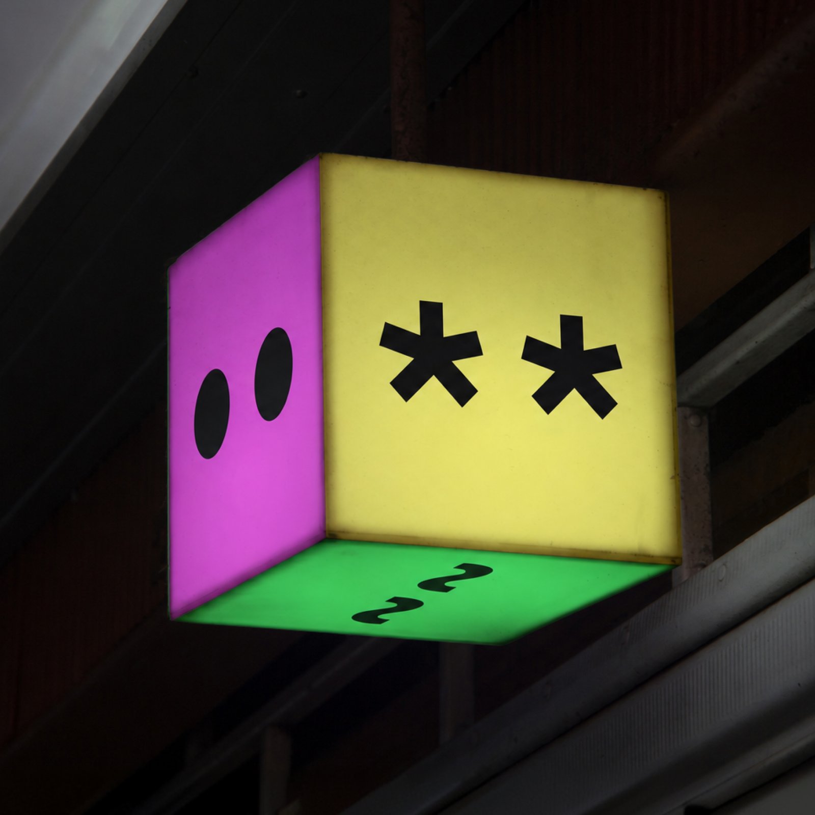
Pact gives Anagram many forms by building them all from the same square.
Anagram is a company that puts money into new businesses. Pact designed a new look for the company using one square. The square is the starting point for many different pictures. The studio moves and joins squares to make signs and letters. This lets the brand change shape while its parts still look related.
Pact uses the same grid to place the parts of each design. A grid is a set of lines that helps arrange things. Some designs show groups of coloured dots that represent networks. Others use simple signs with letters or numbers beside them. These basic parts help make a complex subject feel easier to approach.
The logo can also change and make room for small figures. Pact calls one of these figures the A-man because it sits inside an A. The figure comes in eight colours and eight expressions. It stands for the different people who build the networks Anagram supports. The changing figure brings a personal side to the design.
The same style appears on signs, posters and the company website. A large pink sign uses simple marks made from the system. Smaller items such as stickers and bags use the same grid. Each place can show a different mix of parts and colours. The square and its rules help viewers see the connection. That is how Pact gives Anagram a flexible look.
핵심 표현
build from
~을 바탕으로 만들다
We can build from one simple shape.
make room for
~이 들어갈 자리를 만들다
We need to make room for another image.
sit inside
~ 안에 자리하다
The picture sits inside a square.
AI를 사용해 생성되었으며, AI는 실수를 할 수 있습니다.